
Updating existing UI is a delicate task for which one needs to deal change resistant users and keeping in mind that old habits cannot be changed at once. The jobs presented below popped up in my career for different reasons, before I even started to learn design.
A slider facilitates the comparison between bnefore and after the update of each interface.
2025 - Update of section selectors on WTI - Paragon ID
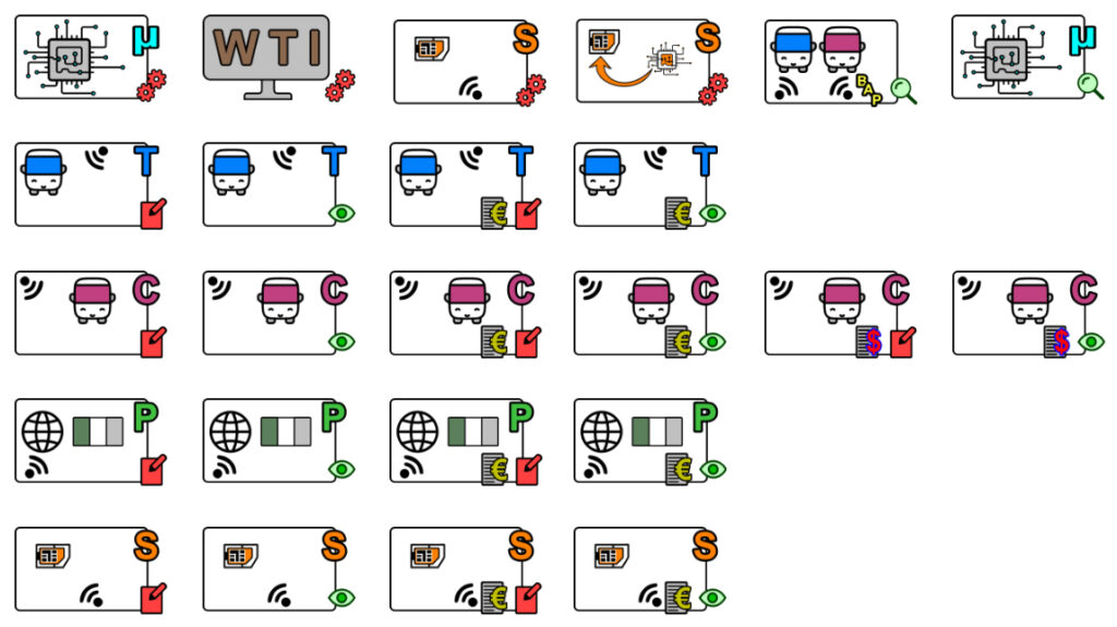
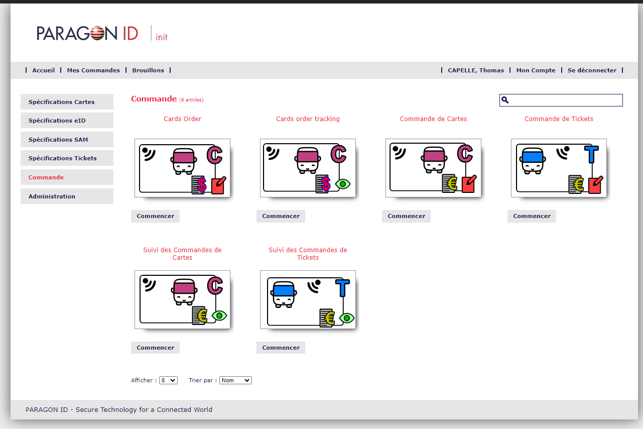
The company Paragon , for which I worked from 2019 to 2025, used open images from various internet sources to illustrate the fonctionalities of an internal online application. Though easy to understand, they were not homogeneous all together and the global feeling of the web application was an lack of consistency. I took time to create a full set of small images to present the functionalities and keep consistent by using a hierarchy: Product / Action / Authorisation level.
In short,
- Each type of product is symbolized by a letter, a pictogram (Bus, Passport, Chip or Chip card) and a colour code (Blue, Pink, Green or Orange):
- All possible actions are represented by a pictogram (Order, Administration, Search, Technical specification);
- Each level of authorisation goes with a pictogram (eye or handbook and pen) and a colour code (green or red).
Board of the updated functionality accessors
Final board with all items in place.
Updated interface
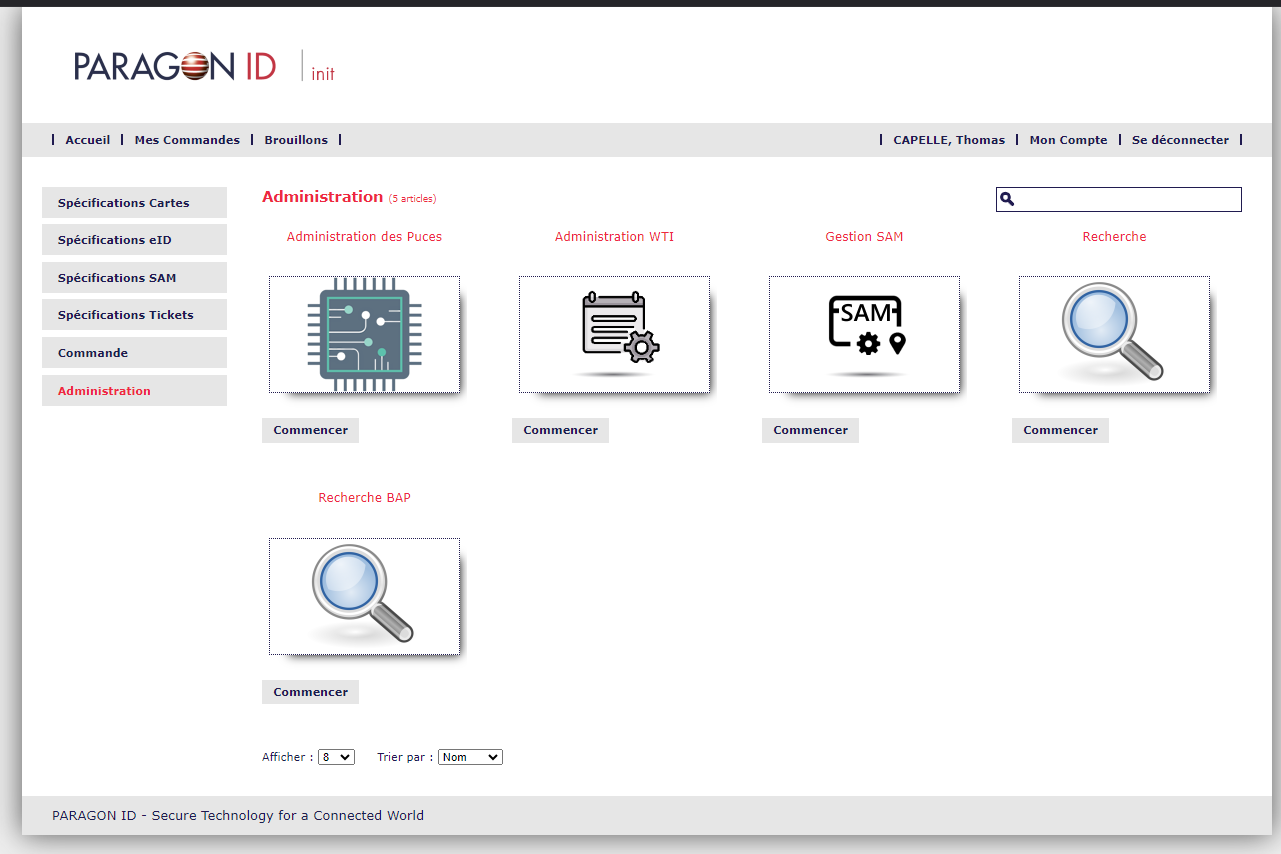
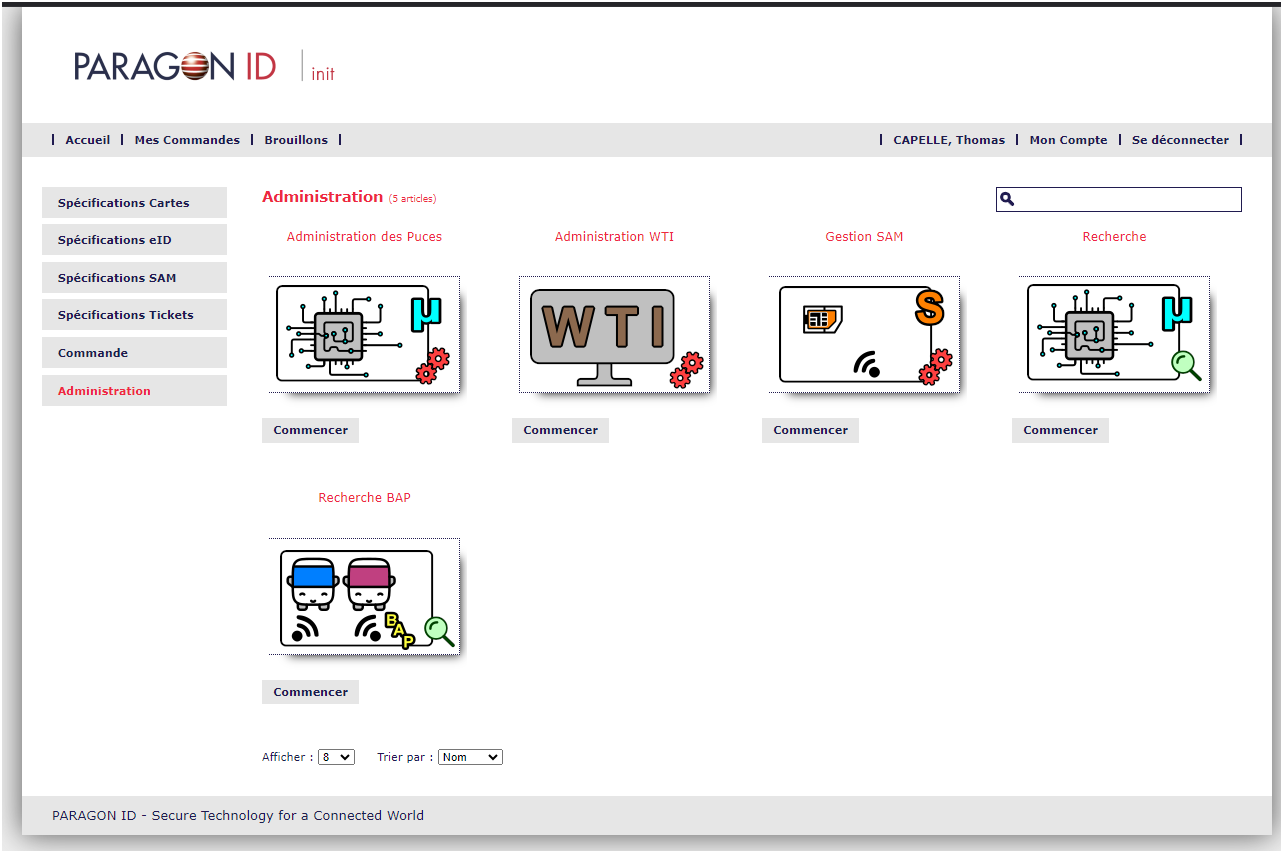
Tool administration screen
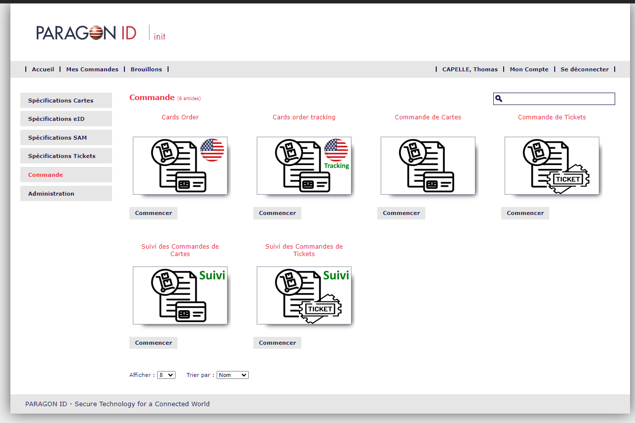
Orders administration screen
Refreshed interface showing consistent design between different range of products.
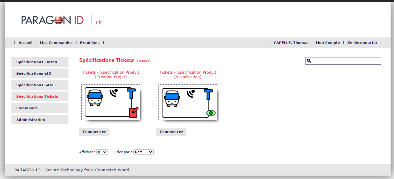
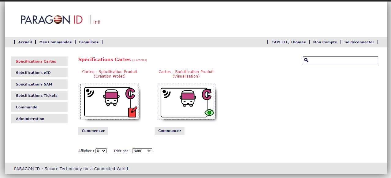
Consistency of UI between different product ranges.
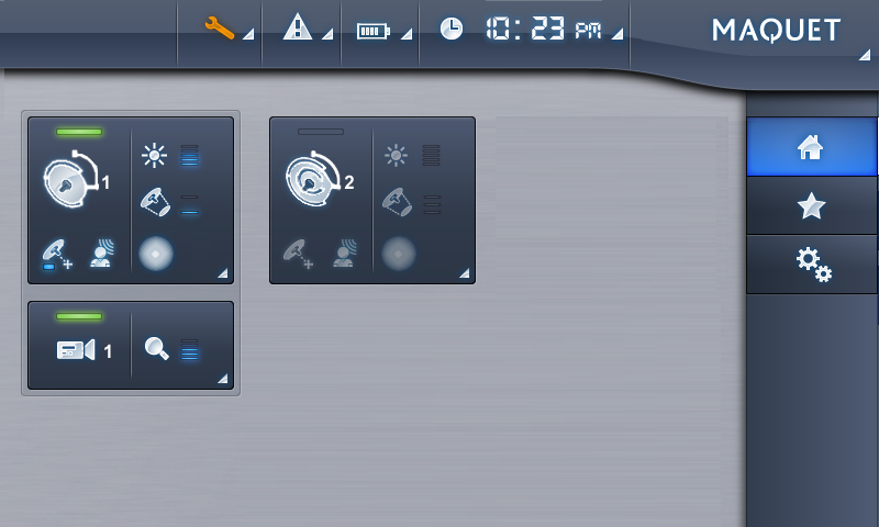
2017 - Update of AXONE interface - Maquet/Getinge
Two different updates took place in this project:
1- Addition of graphical elements to the existing interface with Maquet brand identity
I created new pictograms to introduce new product features in the portfolio of Maquet.


Existing icons (left) and newly designed icons (right).
2- Update of Company's brand identity
Later the same year, the Brand identity of the Group changed. I updated the complete interface of the 10" touch screen used to control Surgical ligths. The new brand identity of the Getinge Group was based on flat design.
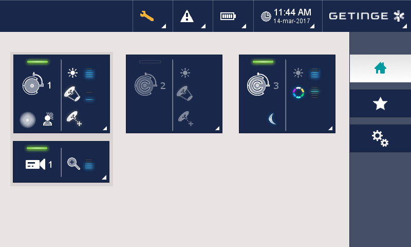
Screens before (left) and after (right) the update.
Continue to the Photography portfolio or go backhome.